How to Make a Magazine
Making a magazine starts with working out what you actually want to put in it. Before you get too far into the design, it’s worth thinking about the content, how many pages you’re likely to need and what you want the finished magazine to look like.
Size is worth thinking about early too. A4, A5, A6, DL and square formats are all available, and if you’re going for a stapled magazine, you can have anything from 8 to 72 pages.
Whether you’re creating something for your business, an event or your own publication, getting those basics sorted first will make the rest much easier.
Planning Your Magazine
Start with the content. Think about who the magazine is for and what you want them to get from it, then make a rough list of what you want to include. That could be articles, interviews, photography, illustrations, adverts or a mixture of everything.
From there, you can start putting together a rough running order. You don’t need to know exactly what every page will look like yet. Just having an idea of where your main features will sit and roughly how many pages they’ll need gives you something to work around.
Think about the finished size at this point too. A larger magazine gives photography and longer pieces of content more room, while a smaller format can work well for something you want people to easily pick up and carry around.
It’s also worth checking the requirements for the type of magazine you’re planning to print before you get too far. Your page count and the way the magazine will be bound can affect how the artwork needs to be set up.
How to Design a Magazine
Once you’ve got a rough plan, you can start bringing the pages together.
Try to keep some consistency throughout the magazine. Using the same fonts, colours and general style from one page to the next helps everything feel like part of the same publication.
That doesn’t mean every page has to follow exactly the same layout. An interview might need something quite simple, while a page built around photography can give the images much more room. You can change things as you go without making every spread feel completely different from the one before it.
Think about what you want someone to notice first on each page too. A clear heading, strong photograph or larger piece of text can give the reader somewhere to start rather than making everything compete for attention.
Planning Your Magazine Layout
It’s easy to concentrate on one page at a time, but have a look at how they work together too.
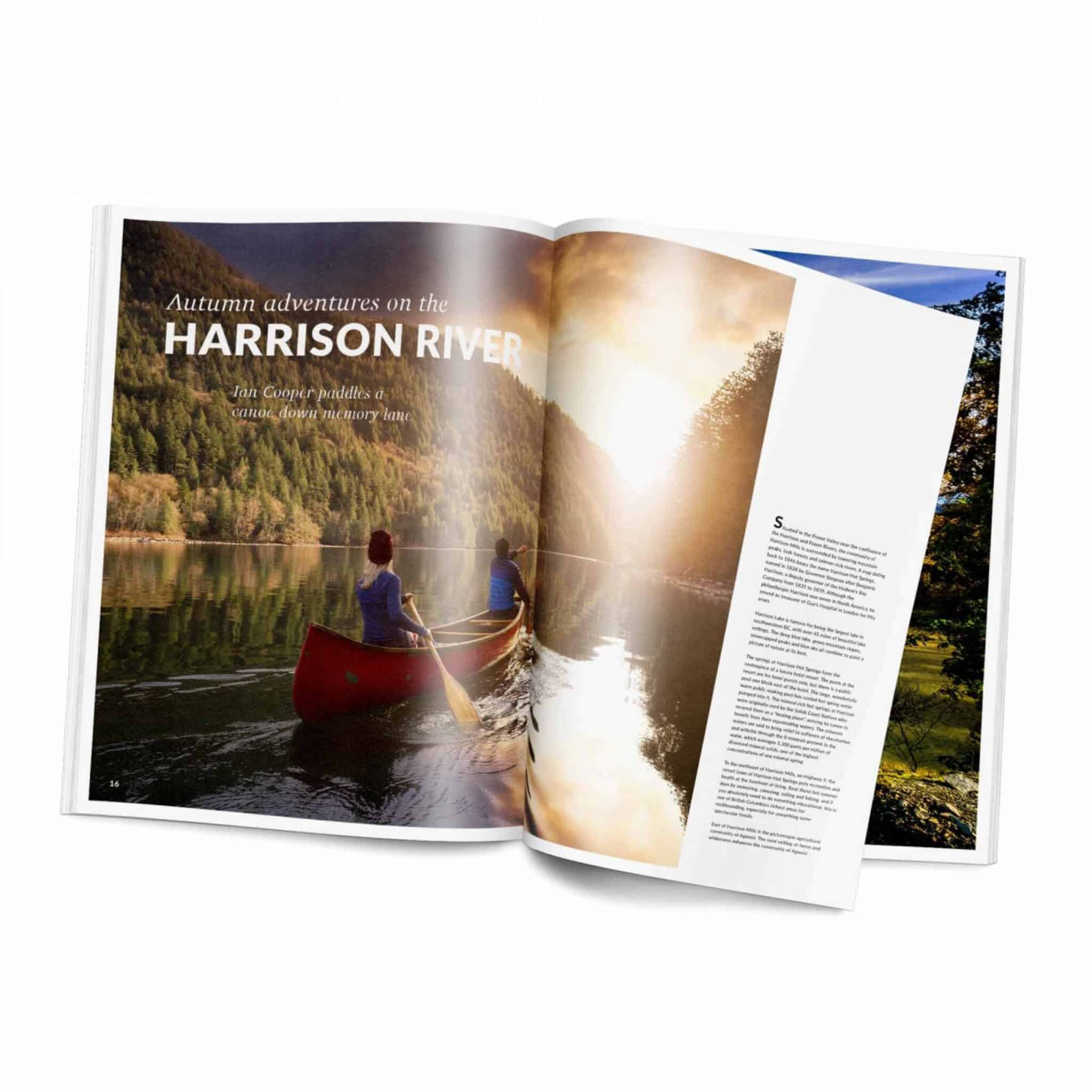
Some pages will naturally sit alongside each other as a spread, particularly if you’ve got a large photograph or feature running across both. Just be careful about putting anything important too close to the centre, where part of it could disappear into the binding.
Keep an eye on things that appear throughout the magazine as well. Page numbers, headings and other repeating elements usually look better when they stay in a consistent position.
It can help to look through the pages in order as you’re working rather than waiting until the end. You’ll soon notice if several busy pages have ended up together or one part of the magazine feels completely different from the rest.
Designing a Magazine Cover
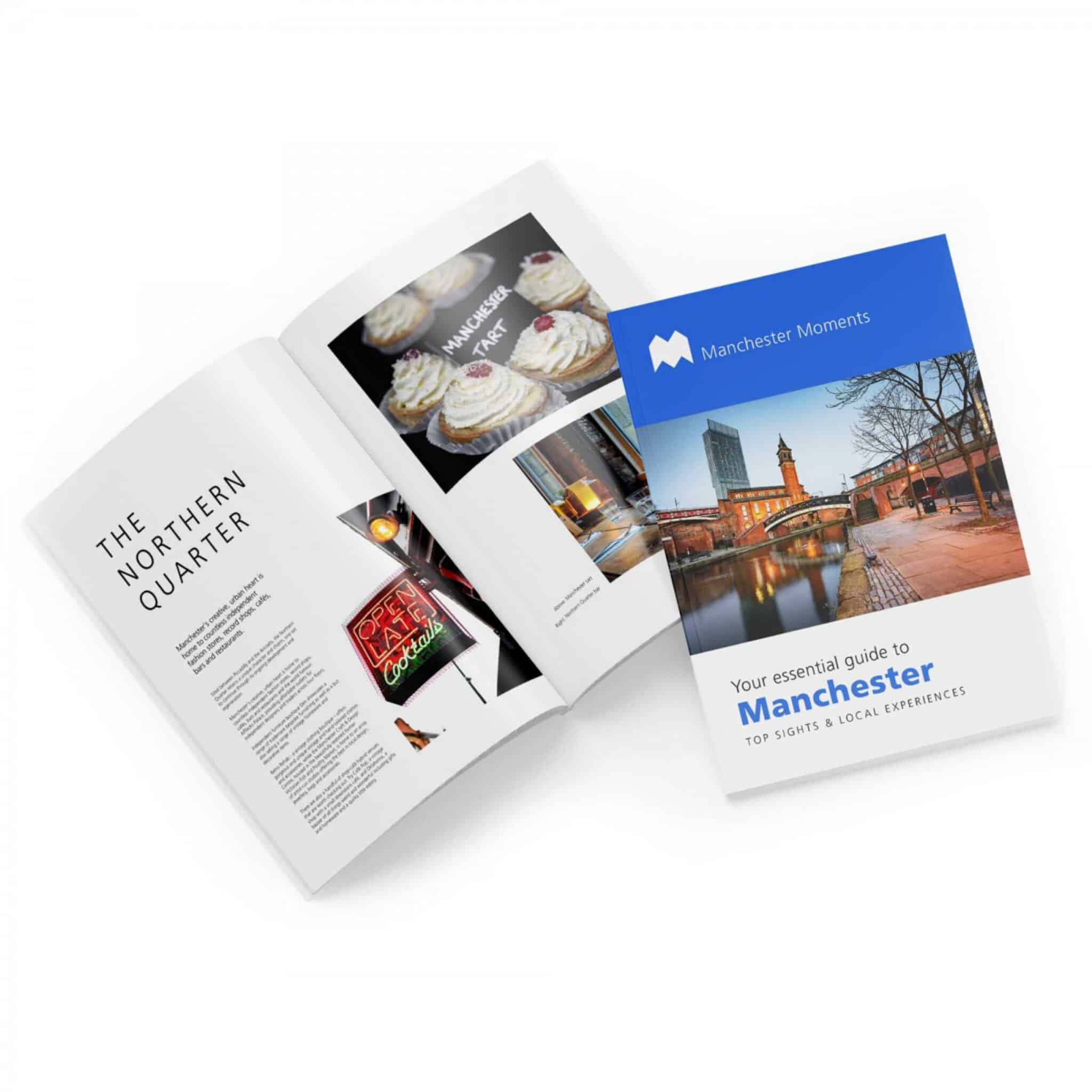
The front cover is usually the first part of your magazine somebody will see, so it needs to give them a good idea of what’s inside without trying to fit everything onto it.
Start with the main image or artwork and work around that. Your magazine title needs to be easy to spot, then you can decide whether any other headlines or information actually need to be on the front.
Think about the cover as part of the whole magazine too. The fonts, colours and imagery don’t need to be identical to the pages inside, but they should feel like they belong together.
And don’t forget the back. Depending on the magazine, you could use it for artwork, contact information, an advert or simply carry the design around from the front.
Getting Your Magazine Ready for Print
Once the design is finished, there are a few things worth checking before you send it to print.
Anything that runs right to the edge of a page needs to continue into the bleed. At the same time, keep page numbers, text, logos and anything else you don’t want trimming off comfortably away from the finished edge.
Have a look at your photographs at roughly the size they’ll actually be printed too. An image that looks perfectly sharp while it’s small on screen can start to lose quality if it’s stretched across a full page or double-page spread.
The centre of the magazine needs some thought as well, particularly if you’ve got text or important parts of an image close to the binding. Give them enough room so nothing gets difficult to read once the pages are put together.
Before uploading the finished artwork, look through the exported PDF from beginning to end. Check the page order, spelling, image quality, bleed and anything sitting close to an edge. It’s much easier to spot something now than once the magazines have been printed.
Choosing Paper and Binding
Paper can make quite a difference to the finished magazine. Photography and colourful artwork can work well on a smoother stock, while something more text-led might suit a more natural paper.
You don’t necessarily have to use the same paper weight throughout either. A heavier cover can give the magazine a little more structure while keeping the pages inside lighter.
Binding is another thing to think about before everything is finalised. Stapled magazines are folded and saddle stitched through the spine, while perfect bound magazines have a square spine and are better suited to more substantial publications.
The right option comes down to the magazine you’re making, the number of pages and how you want the finished piece to feel.