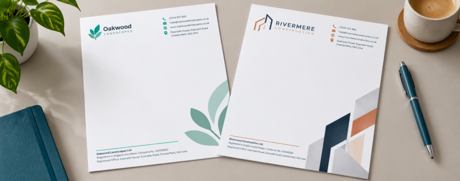
What Should Be on a Company Letterhead? UK Guide & Examples
A letterhead seems like a fairly simple bit of stationery until you actually come to design one.
You’ve got your logo, contact details and company information to fit in, but you still need to leave enough room for the thing the paper is actually there for… the letter.
If you’re a UK limited company, there are also a few details you legally need to include, so it’s worth getting those sorted before spending too much time moving logos and colours around.
The good news is that a company letterhead doesn’t need loads on it to work well. Usually, keeping things simple makes it much easier to use.
What actually needs to go on your letterhead?
Company letterhead, headed paper, letter headed paper… they’re all describing much the same thing. It’s your business stationery with the company branding and details already printed onto the sheet, ready for you to add the actual letter.
Most business letterheads are A4, which is 210mm x 297mm. That keeps things straightforward for office printers, envelopes and everyday correspondence.
What you put onto the page depends a little on the business, but a logo, company name and a few useful contact details will normally be somewhere in the design.
If you run a UK limited company, there are also some details that need to appear on your business letters:
- your full registered company name
- your company registration number
- your registered office address
- the part of the UK where the company is registered, such as England and Wales, Scotland or Northern Ireland
Your registered company name should be the official name of the business. For most limited companies, that will include Limited or Ltd.
You can check the latest requirements in the official GOV.UK guidance.
None of that means the bottom of the page needs to turn into a huge block of legal text. Registration details are often kept neatly in the footer where they’re easy to find without becoming the main part of the design.
You don’t have to include your directors’ names either. If you do choose to name directors on the letterhead, you need to include all of them rather than selecting just one or two. If you show the company’s share capital, the amount stated should be the paid-up share capital.
Those particular requirements apply to limited companies. Sole traders, partnerships and other business structures have different rules, so it’s worth checking what applies to you if you’re unsure.
Once the legal side is covered, think about what somebody receiving the letter might actually need. A telephone number, email address, website or trading address can all be useful, but you don’t have to squeeze every possible way of contacting the business onto the page.
A letterhead isn’t a miniature company brochure.
Don’t forget you still need to write on it
This is where letterhead designs can start to get a bit carried away.
A blank A4 sheet looks like it has loads of space, so it’s tempting to make the logo bigger, add a coloured block down one side, bring in a pattern and then fill the footer with contact information.
Then somebody tries to put an actual letter on it.
Add an address, date, a few paragraphs and a signature and suddenly there isn’t quite as much room as you thought.
Before you finish the artwork, drop a normal letter into the design and see how it feels. You’ll quickly spot if the header is taking up too much room or if something at the bottom is creeping into the area you need for writing.
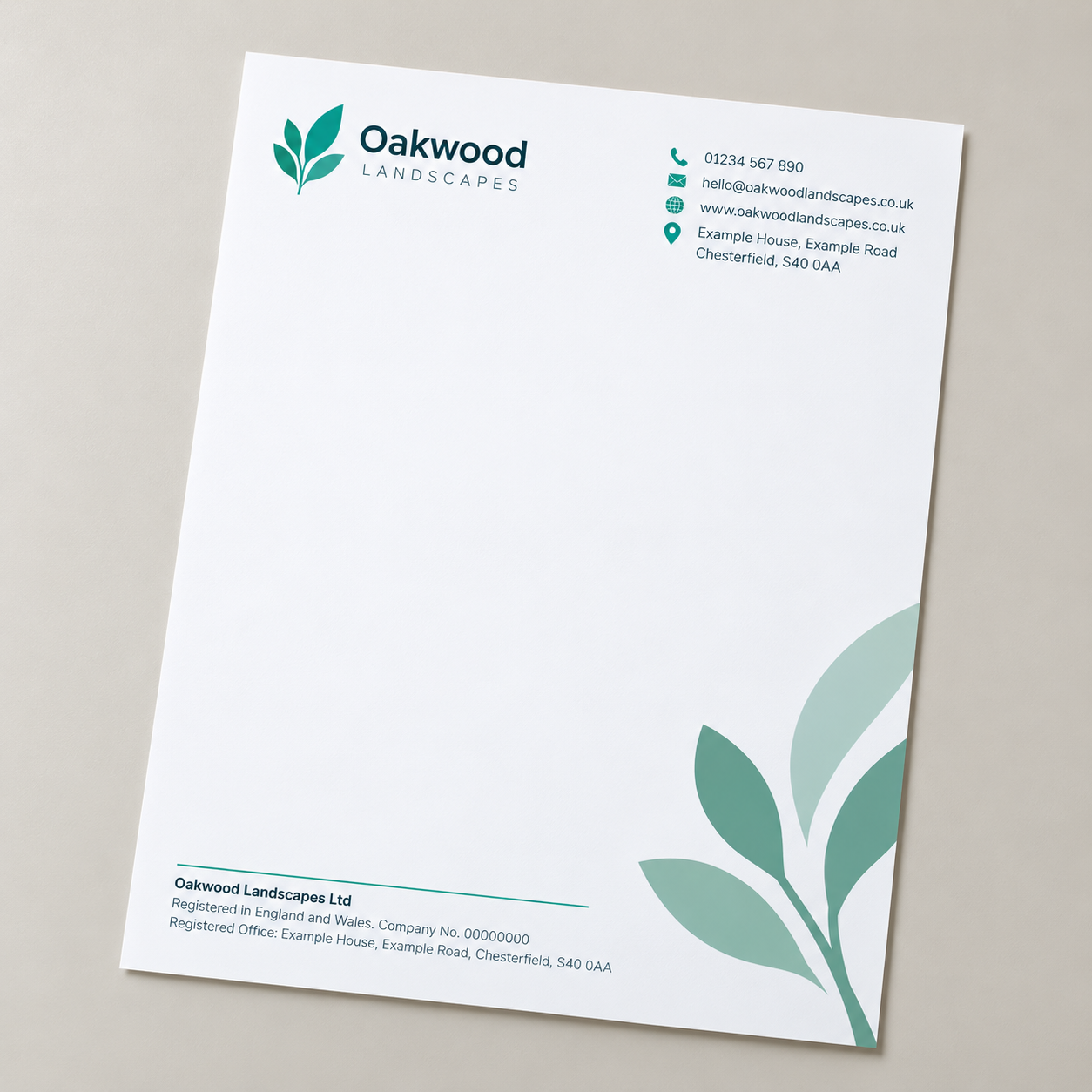
There isn’t one company letterhead format you have to follow. A simple layout might look something like this:
| Area | What you might include |
|---|---|
| Top | Logo and company name |
| Side | Contact details or a small brand element |
| Bottom | Registered address and company details |
| Reverse | Optional brand colour or supporting artwork |
That’s only one way of doing it.
You might keep almost everything in the footer, put contact details down one side or use a small area of colour across the top. What matters more is that the important bits are easy to find and there’s still enough room for the letter itself.
Your legal details can sit quietly in the background. Your logo and company name should be easier to spot. The actual letter should still be the thing taking up most of the page.
Think about how the letterhead will actually be used
A letterhead can look brilliant on screen and still be awkward once it gets into the office.
If the headed paper is going through a desktop laser or inkjet printer every day, that needs to be part of the decision when you choose the stock and design the page.
Heavy areas of colour are worth thinking about too.
A large block of brand colour might look great on the reverse or around the edge of the sheet. Putting it directly behind an area where somebody later needs to print several lines of small black text may not work quite as well.
The same goes for anything likely to be photocopied or scanned. Very pale text, subtle background patterns and low-contrast details can behave differently once the letter has gone through another machine.
You don’t have to design for every situation the sheet might ever find itself in, but it helps to think one step beyond how it looks on your monitor.
Choosing the paper
Letterheads will often use an uncoated paper because it gives you a good surface for writing and overprinting.
It also tends to feel more natural for everyday business stationery than a glossy paper would.
You can go a little heavier than ordinary copier paper if you want the letter to feel more substantial, but heavier doesn’t automatically mean better.
If you’re sending a lot of everyday correspondence, something practical that runs comfortably through the office printer may be exactly what you need. If the letterhead is part of a more premium bit of stationery, the feel of the paper might matter more.
Recycled stocks can work well too if they suit the rest of your branding.
Start with how the letterhead will be used, then choose the paper around that rather than choosing the fanciest stock first and trying to make everything else fit.
Making it look like your business
Once the useful stuff is in place, you can have a bit more fun with the design.
Some company letterheads don’t need much more than a good logo, a little brand colour and a tidy footer.
Others can carry more personality.
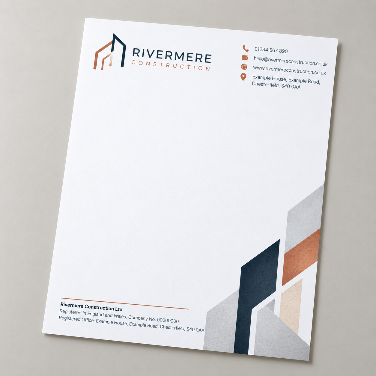
You might use a thin coloured line, a shape taken from the logo or a subtle pattern that already appears elsewhere in the brand. A more creative business could make more of illustration or photography if it feels right.
You don’t have to use every idea at once.
If the logo and company details already give the page enough character, adding another three design elements probably isn’t going to improve it.
It’s also worth looking at the rest of your stationery while you’re designing it.
If you already have business cards, compliment slips, printed envelopes or presentation folders, using the same colours, typefaces and logo treatment will help the whole lot feel connected.
They don’t all have to look identical. A business card has a completely different job to a sheet of headed paper, so forcing the same layout onto both usually doesn’t make much sense.
They just need to look as though they came from the same business.
Check it before you print it
Letterheads tend to stick around for a while, especially if you’re ordering a decent quantity, so give everything one final check before the artwork goes anywhere near print.
Check the company name, registration number and registered office address against the official details rather than relying on what was on the old letterhead.
Have another look at phone numbers, email addresses and the website while you’re there.
Then check the logo and any images at full size. Something can look perfectly sharp while you’re looking at the whole A4 page on screen and turn out to be a little rough once you zoom in.
Finally, put a proper letter over the design one more time.
If there’s enough room to write, the important information is easy to find and the page still looks like your business, you’re probably ready to go.
A good company letterhead doesn’t need to do everything. It needs to carry the right information, make the business easy to recognise and leave enough room for whatever you actually need to say.
If you’re ready to get yours printed, take a look at our letterhead printing options.