Poster Size Guide: Choosing the Right Size for Your Poster
Choosing a poster size sounds pretty straightforward until you’re looking at A4, A3, A2, A1 and A0 and trying to picture how big each one actually is.
The best place to start is with where your poster is going. Something sitting in a shop window at eye level doesn’t need to do the same job as a poster being viewed from across a much bigger space.
So before automatically going for the biggest one, think about where it’ll be seen, how close people will get to it and what you’re actually trying to fit onto the page.
Poster Sizes from A4 to A0
If you’ve worked with A4 paper before, you’ve already got a useful starting point.
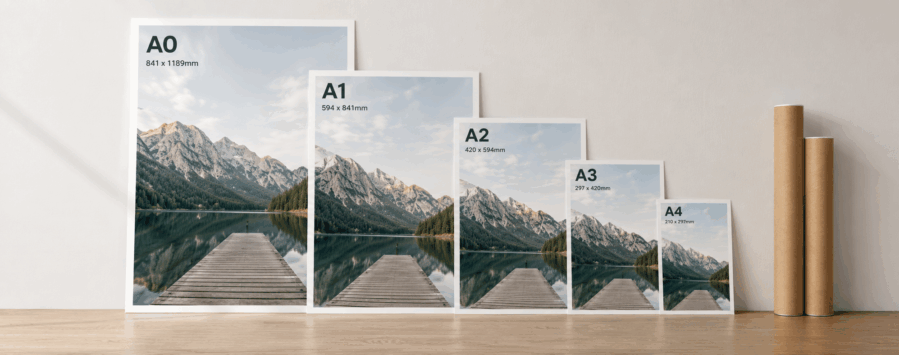
A3 is twice the area of A4. Move up again and A2 is twice the area of A3, then you’ve got A1 and finally A0.
The proportions stay the same as you move through the sizes, they just get progressively bigger.
| Poster Size | Millimetres | Centimetres | Inches | Pixels at 300dpi |
|---|---|---|---|---|
| A4 | 210 × 297mm | 21 × 29.7cm | 8.27 × 11.69in | 2480 × 3508px |
| A3 | 297 × 420mm | 29.7 × 42cm | 11.69 × 16.54in | 3508 × 4961px |
| A2 | 420 × 594mm | 42 × 59.4cm | 16.54 × 23.39in | 4961 × 7016px |
| A1 | 594 × 841mm | 59.4 × 84.1cm | 23.39 × 33.11in | 7016 × 9933px |
| A0 | 841 × 1189mm | 84.1 × 118.9cm | 33.11 × 46.81in | 9933 × 14043px |
Those measurements are shown in portrait. Turn the poster on its side and the dimensions simply swap around.
The pixel sizes are based on artwork at 300dpi. If you’re working at a different resolution, the number of pixels will change even though the physical size of the poster stays the same.
So, Which Poster Size Should You Choose?
Measurements only tell you so much. It’s easier to choose once you start thinking about what each size will actually be doing.
An A4 poster is fairly compact. It makes sense somewhere people are already going to be close enough to read it… on a noticeboard, beside a counter or as a smaller display in a window.
A3 gives you a bit more breathing room. At twice the area of A4, there’s more space for a strong image or headline without the poster suddenly becoming huge. It’s a handy size for menus, promotions, smaller events and shop displays.
Once you move up to A2, you’re getting into a more substantial poster. There’s room to let photography or artwork do more of the talking while still leaving space for the important details.
A1 is considerably bigger again. If you’re trying to catch someone’s attention before they’re standing directly in front of the poster, that extra size starts to become useful. Think exhibitions, events, retail spaces and larger displays.
Then you’ve got A0. At just under 1.2 metres tall in portrait, it’s big. That’s exactly what you might need for the right space, but it also needs artwork that can handle being printed at that size.
There isn’t really one ‘best’ poster size. A well-designed A3 in the right place can work far better than an A0 that’s much too big for the space around it.
Think About Where Your Poster Is Going
It’s easy to choose a size while you’re sitting in front of your computer and forget about where the finished poster will actually end up.
If someone’s going to be standing quite close to it, you can include smaller information that they’ll have time to read. Move the poster further away and those details quickly become harder to pick out.
A larger poster gives you more room to work with, but you don’t have to fill it.
Give the main message some space. If there’s a headline you want people to notice first, make sure it actually looks like the first thing they should read. The same goes for a product, photograph, event date or offer.
Trying to make five things equally important usually ends up making none of them particularly easy to notice.
It’s worth looking at the physical space too. Portrait might be the obvious choice for a narrow window or wall, while landscape can work better across a wider space. Start with where the poster is going rather than trying to make the space fit the artwork afterwards.
Bigger Posters Need Better Images
This is one of the easiest things to overlook.
An image that looks absolutely fine across an A4 poster has a much easier job than that same file stretched across A0. The larger you make it, the easier it becomes to notice if there wasn’t much detail in the original.
For high-quality print, 300dpi at the final size is ideal.
The important part there is at the final size. Simply changing a small image to 300dpi doesn’t suddenly add all the missing detail back in.
If you’re planning a larger poster, start with the best version of the image you’ve got. Have a proper look at faces, text, logos and other fine details. If they’re already looking soft or pixelated at the size you’re planning to use them, going bigger isn’t going to fix them.
Getting Your Poster Ready for Print
Once you’ve settled on a size, set your artwork up to match it.
If a background image or colour is supposed to reach the edge of the finished poster, you’ll also need some extra artwork beyond the trim. We work with 3mm bleed, which gives a little room when the poster is cut down to its finished size.
Keep text, logos and anything else important safely inside the finished edge too. You don’t want something important sitting uncomfortably close to where the poster will be trimmed.
And if you’ve designed a poster at one size and later decide you want a much bigger version, give the artwork another check before sending it to print. The proportions might still work, but the images inside it need to be good enough for the new size as well.
Once you’ve got the size and artwork sorted, you’re ready to get it printed. Take a look at our poster printing options and choose the size that works for where your poster is going to be used.